Your book cover design is the first thing potential readers notice when they spot your book, and it’s meant to be that way. That’s why it needs to be good! And good book cover design requires a few things you may not have thought of.
Book Cover Design Needs to Look Professional
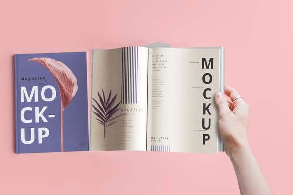
There’s more than good graphics involved in a professional looking book cover design. Everything from the size, to the paper treatment and what’s on the back(yes, even the back) all come together to signal that your book is worth reading. We’ve listed the elements you need to consider.
The Trim Size Matters
Did you know books come in standard trim sizes? Well, they do. If you’re varying from the standard 5.5 x 8.5 or 6 x 9 used for most novels, memoirs, and self-help books it will get noticed. There are exceptions of course. If you’re publishing a portrait book, generally they’re 8.5 x 11—big enough to showcase the work within but compact enough to be reasonable to print.
The smallest size of 4.25 x 7 is usually used for some novelty book covers and potentially for young adult titles when a page count increase is desired.
Paper Treatment Makes a Difference
Depending on the feel you want there are options for your cover treatment. In this case, we’re simply talking paperback books, which are the most common choice for self-published and indie authors. Why? Because it’s more cost effective. Your basic options are glossy and matte.
You can get fancy and have a textured finish too of course!
But choosing between a glossy or matte finish isn’t just about looks. With certain genres, certain treatments are standard. And there’s even times when it changes the look of the graphics and how the colors appear, so it’s best to carefully consider and even consult with an expert on your choice.
The Graphics for Your Book Cover Design
This one is huge! Of course the general layout and the quality of the color and images are super important. Any imagery should be professional looking. And we’re not talking about style and creative liberty here. We’re referring to color saturation, clarity and balance. All of it.
The text should be the right size, in the right place and in a style specific to your genre. Whether it’s a young adult book, or a historical novel with totally different genre conventions, you can be creative but in a GOOD way.
Other Book Cover Design Elements That Get Overlooked
At MCM we often do cover redesigns. Here are some of the biggest mistakes we see outside of bad graphics and poor cover treatment decisions:
- Using BY before the author name
- Not having a barcode
- Overly detailed book summaries rather than compelling book copy
- The spine text doesn’t read top to bottom
- The Imprint logo isn’t there or in the wrong place
- No human readable price(that’s the dollar sign price above the barcode)
- Overly long or irrelevant bios
These mistakes, especially when combined with poor cover art and graphics just scream self-published and not thought out. It makes potential readers question your authority and the quality of the book itself, even if they don’t recognize exactly what it is that’s wrong.
Because your book cover design is it’s most powerful marketing tool, it needs to be the best it can be. And though you can always do a redesign, it’s always best to get it right the first time. Otherwise your time and money and energy are wasted on a book that may bomb despite what’s inside.
Recent Comments